Data can be discrete, having distinct separate values with no possibility of in-between values e.g. eye colour and favourite movie or continuous, having intermediate values e.g. heights and weights.
Discrete data
Discrete data can be quantitative (having countable, numerical values) e.g. number of students writing math or categorical data (having distinct categories) e.g. favourite colour. Categorical data itself can be:
- Nominal - having categories with no order or ranking e.g. eye colour and favourite snack
- Ordinal - having categories that can be ordered or ranked e.g. T-shirt sizes (S, M, L, XL) and final grade for a course (A, B, etc.)
Continuous data
Continuous data is also known as scale data because the data is often retrieve from the scales (the continuous, graduated sections) of measuring instruments. Continuous data can be classified as:
- Interval - having no true zero value or reference point (meaning they can be negative) e.g. temperature measured in degrees Celsius ($\degree C$)
- Ratio - having a true zero (no negative values) e.g. height, distance and weight
Based on the types of data we have, we can choose from the set of graphs which one is the most appropriate to visual our data.
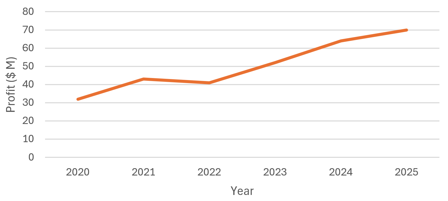
Line graphs
These are graphs used to show the relationship between an ordinal variable e.g. time in years and a continuous variable e.g. the profits of a company:

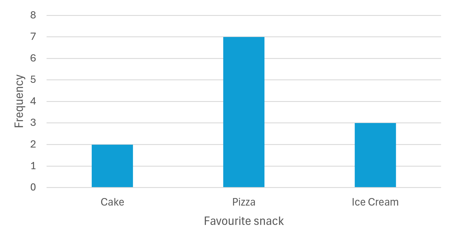
Bar graphs
These graphs are used to compare the various groups/categories of data to each other. Consider the bar graph:

It is very easy to see which category is the most loved and which is the least favourite among the students. A categorical variable is on the x axis and a numerical variable (usually a quantitative discrete variable e.g. frequency) is on the y axis.
Q1: Discrete data cannot have intermediate values
- True
- False
Only continuous data has intermediate values
Pie charts
These are better for comparing the proportions of the various categories relative to the whole dataset. A pie chart helps us to compare a category to the whole dataset as opposed to solely the other categories. Consider the pie chart:
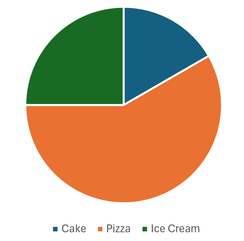
It is very easy to see which category of snack is the most favoured by the students and how much of the overall dataset it comprises.
Histograms
These are bar graphs with no space between the bars. It makes for easier comparison but the other implication of having no space between the bars is that the end of one category/group is the beginning of another.
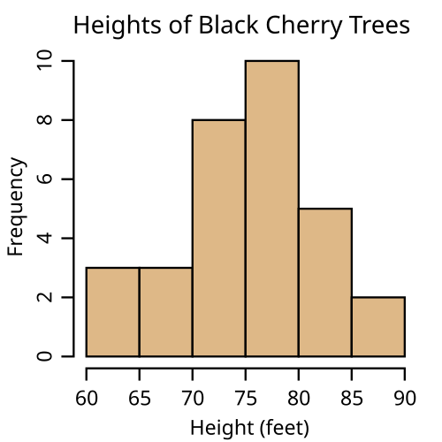
Image Credits: Wikipedia

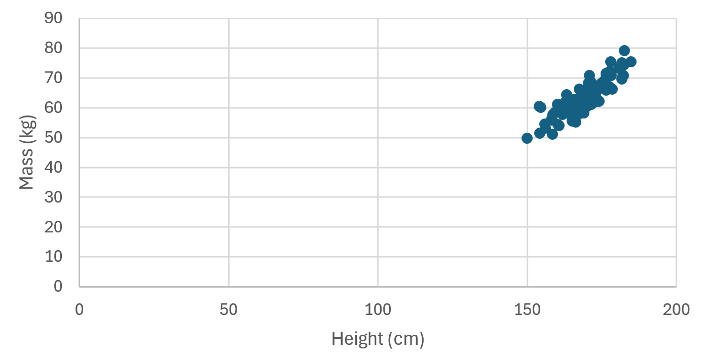
Scatter plots
The line graph has the limitation whereby it does not allow us to plot in-between values as is the case with continuous data such as the heights of students in a class. The scatter plot does allow such intermediate values.
On a scatter plot, we plot one continuous variable (our $y$ variable) against another continuous variable (our $x$ variable):

Q2: A bar graph has no spaces between the bars
- False
- True